Hospitality · Brand identity & web design
McKevitt’s
Family heritage. Mountain colours. A familiar welcome.
A connected identity and website for a family-run hotel, restaurant and bar in the heart of Carlingford.
- Our role
- Logo design · Branding · Web design · Menu design · Brand identity · WordPress development
- Platforms & tools
- WordPress · Google · Kinsta · Cloudflare
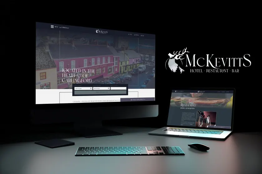
A warm welcome, before the first visit.
The WordPress website brings the hotel, restaurant and bar together. Rooms, dining and Carlingford’s setting lead the experience, with a clear route to availability and booking.
The identity carries into the navigation, typography and colour palette. The family can update menus, offers and events themselves, keeping the website part of the day-to-day life of the hotel.
Explore the website screens 6 images +
A familiar building. A new chapter.
The earlier identities put the Village Hotel building at the centre of the brand. They are shown here as the starting point for the redesign, preserving the link to a familiar place in Carlingford.
The new identity brings the family’s heritage and the surrounding landscape into that story, while respecting the purple and dark colours already associated with the building.
Family heritage, shaped by the landscape.
The colours of the mountain in the evening and at night inspired the palette: layered, muted tones that move into deep purple and dark shades. That sense of place is carried into the landscape within the stag.
The stag comes from the McKevitt family crest. Reinterpreted as the central mark, it connects the hotel’s identity to the family behind it, with the mountain landscape giving the symbol a local character.
See the family crest reference 1 image +
Made to belong here.
Purple and dark colours were already synonymous with the building. The identity was adapted to complement that existing character, so the exterior signage, printed materials and website feel like parts of the same place.
The stag, refined lettering and evening palette bring hotel, restaurant and bar together. The website extends that visual language into pages for staying, dining and visiting Carlingford, while the business cards and exterior sign show how the identity works beyond the screen.
Explore the logo presentations 3 images +
One identity, wherever you meet it.
The exterior sign and business cards carry the same stag, landscape and lettering into the physical experience of the hotel. Together with the WordPress website, they give hotel, restaurant and bar a shared visual language.
Full project background +
A connected brand identity and website for McKevitt’s Hotel, Restaurant & Bar in Carlingford. The stag draws on the family crest, while the colours of the mountain in evening and night complement the purple and dark character of the building. The identity carries through signage, business cards and the website.
A new identity and website for a family-run hotel in the heart of Carlingford. We brought the hotel, bar and restaurant together under one considered brand.
The website puts the rooms, food and setting first, with a clear route to booking. The family can update menus, offers and events themselves.
The website brings rooms, dining and the bar together under one hotel identity. Photography and a restrained dark palette support the browsing experience, with booking and availability links kept visible.